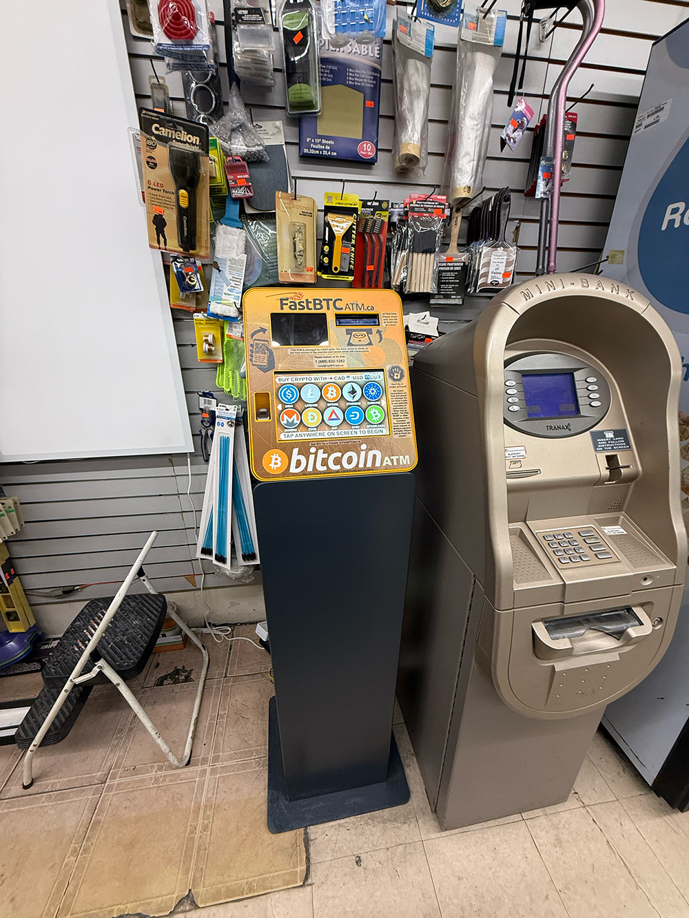
Artifact: FastBTC Cryptocurrency Kiosk Location: Retail Convenience Store
1. User Flow Analysis
The interaction with the kiosk follows a linear, step-by-step process. However, observation revealed significant redundancies that impede the user experience.
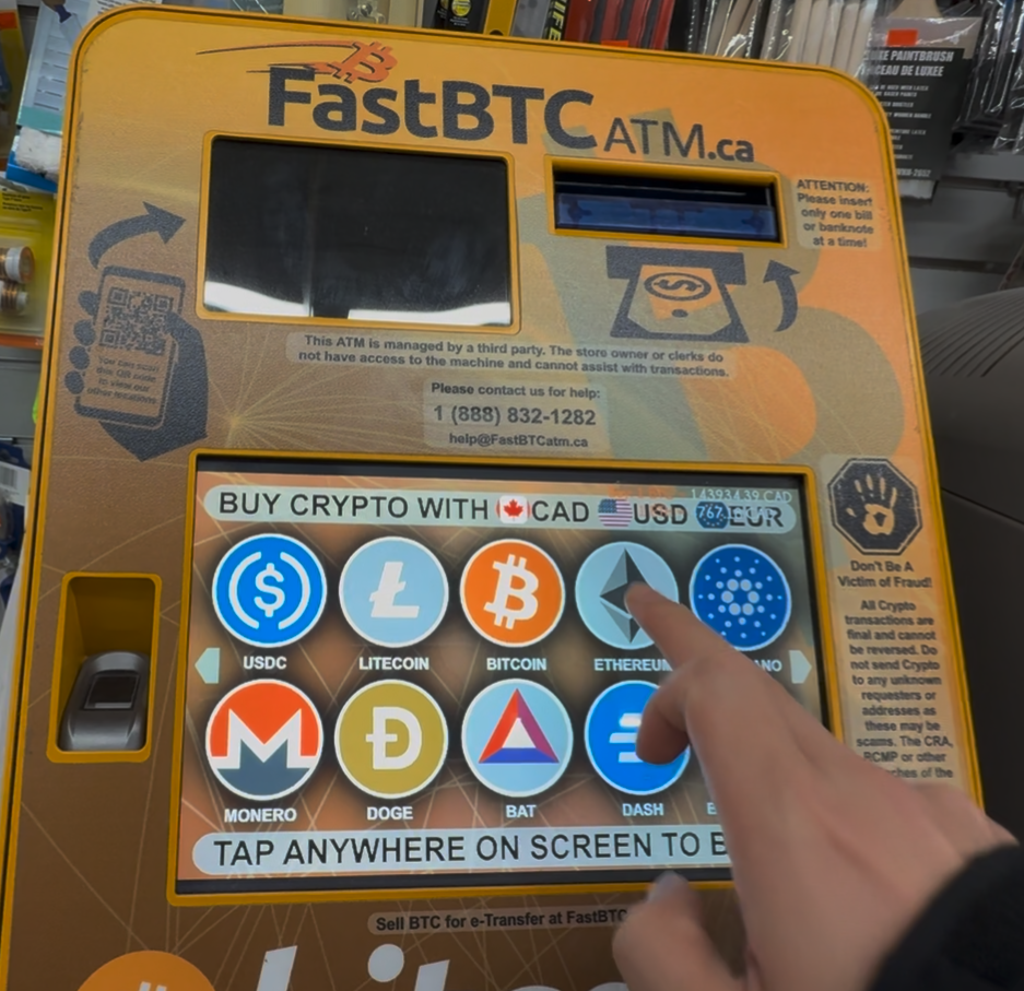
Step 1: Attract & Initial Selection
The user approaches the machine and is presented with a grid of available cryptocurrencies. The user selects "Ethereum" to begin.
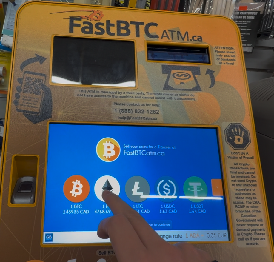
Step 2: Redundant Selection (Friction Point)
Immediately after selecting Ethereum, the interface presents a second selection screen displaying exchange rates. The user is forced to tap "Ethereum" a second time to proceed. This step is procedurally unnecessary and confusing.
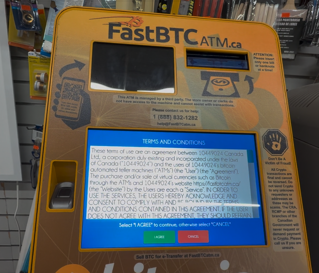
Step 3: Terms of Service
A full-screen text agreement appears. The user must locate and tap "I Agree" to bypass this legal hurdle.
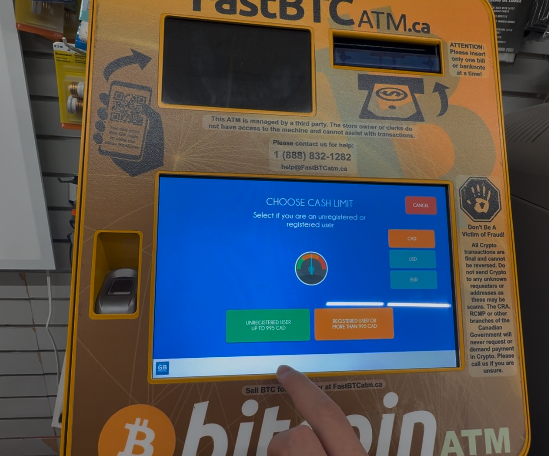
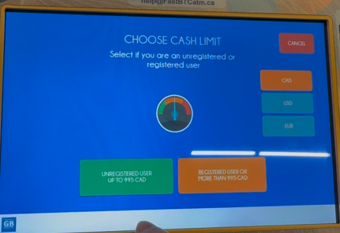
Step 4: Limit Selection
The user must choose between "Unregistered" and "Registered" limits. This screen utilizes a non-functional visual gauge.
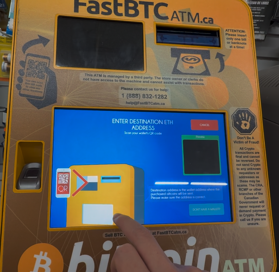
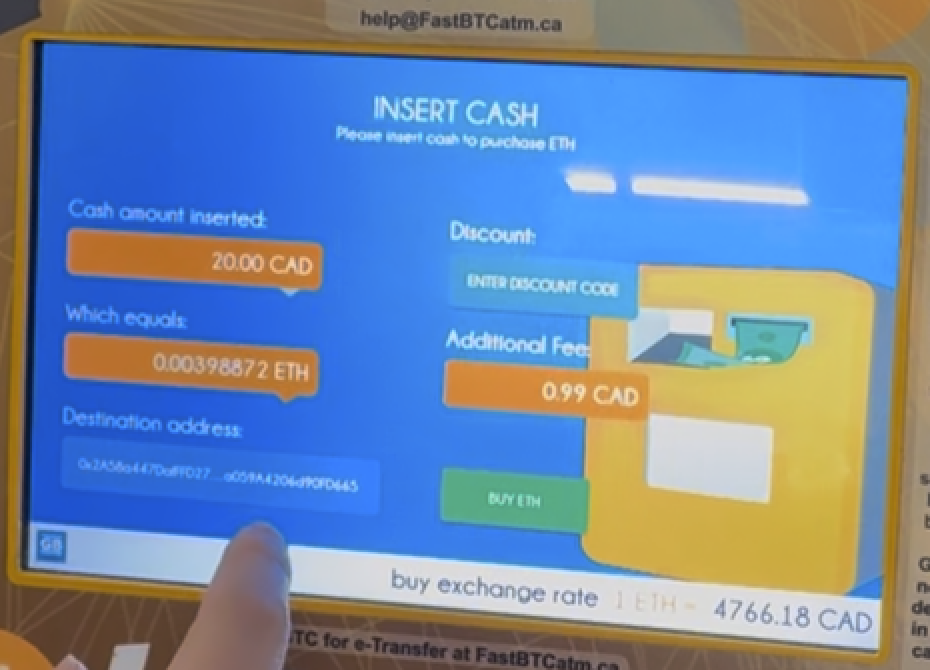
Step 5: Wallet Scan & Payment
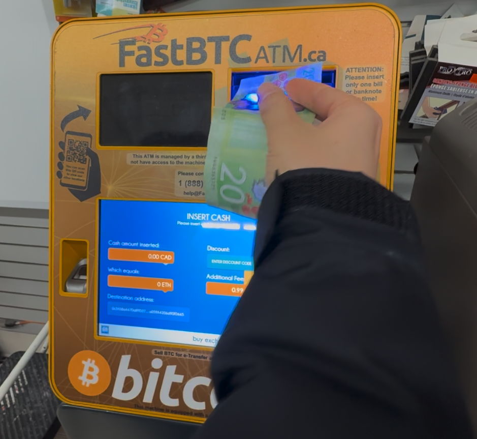
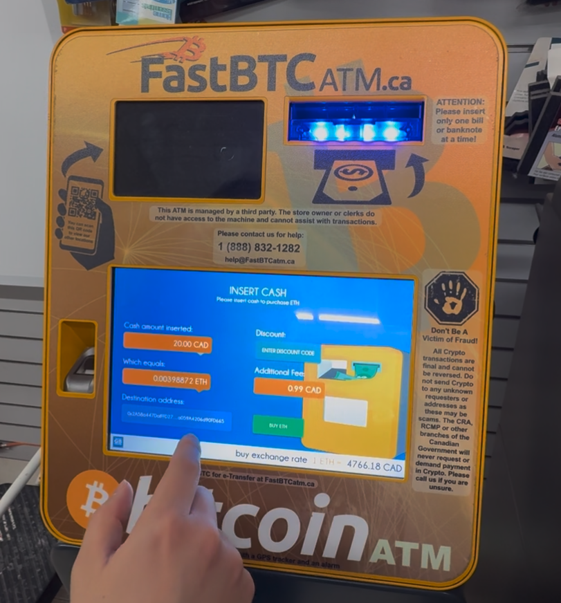
The user scans their QR code and inserts cash. The screen updates in real-time, but critical transaction data is truncated.
2. Interface Critique & Analysis
Encyclopedic (Information Conveyance)
-
The Branding Disconnect: The physical machine is heavily branded as a "Bitcoin ATM," yet the digital interface functions as a multi-currency exchange (Altcoins, Ethereum, Litecoin). This mismatch limits the encyclopedic value of the interface; a user looking for Ethereum might ignore the machine entirely because the physical "container" mislabels the digital "content."
-
Truncated Data: On the final payment screen (Step 5), the destination wallet address is shortened with ellipses (e.g.,
0x2A5...). In the context of cryptocurrency, where a single wrong character results in permanent loss, hiding the full address prevents the user from verifying the transaction data. This is a critical failure in information transparency.
Participatory (User Action & Affordances)
-
Redundant Input: The interface requires the user to declare their intent (Buying Ethereum) twice across two different screens (Step 1 and Step 2). This redundancy ignores the user's initial participation, increasing interaction cost and cognitive load without adding value.
-
False Affordances: The "Limit Selection" screen features a speedometer-style gauge. This graphic suggests a participatory element—something the user can drag or adjust to set a specific limit. However, it is purely decorative. This false affordance distracts the user from the actual task of selecting a button.
Procedural (Rules & Logic)
-
Rigid Linearity: The machine forces the user to accept Terms & Conditions before they even know if the machine can fulfill their specific transaction needs (e.g., available cash limits). A more user-centric procedure would allow the user to set up their transaction first and agree to terms just before the commitment (payment).
-
Ambiguous Labels: The buttons "Unregistered User" and "Registered User" define the user by their administrative status rather than their goal. Procedurally, the user is looking for a limit (how much can I buy?), not a label.
Spatial (Physical & Virtual Boundaries)
- The Physical/Digital Gap: The "Scan QR" screen successfully bridges the spatial gap by showing an animation of a phone being held up to the kiosk. This provides necessary spatial instruction, as the physical scanner is located below the screen, outside the user's primary field of view.
3. Proposed Redesign & Wireframes
To address the issues identified above, the following interface improvements are proposed:
A. Streamlining the Flow (Fixing the Redundancy)
- Change: Eliminate the second currency selection screen shown in Step 2.
- Logic: When the user taps "Ethereum" on the main grid (Attract Screen), the system should immediately pass that variable to the transaction flow, skipping the secondary ticker screen entirely.
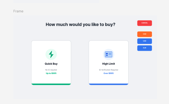
B. The "Limit" Screen (Removing False Affordances)
- Change: Remove the decorative speedometer gauge and confusing "User Status" labels shown in Step 4.
Wireframe Concept:
- Layout: Two distinct "Card" buttons side-by-side.
- Left Button (Quick): Label: "Quick Buy". Subtext: "No ID required. Up to $995". Visual: Lightning bolt icon.
- Right Button (Full): Label: "High Limit". Subtext: "ID Verification required. Over $995". Visual: ID Card icon.
- Benefit: This creates clear affordances based on the user's immediate goal (speed vs. volume).
Before:
After:
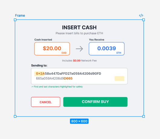
C. The Payment Screen (Trust & Verification)
- Change: Prioritize the verification of the destination address shown in Step 5.
Wireframe Concept:
- Top Section: "Insert Cash" instruction.
- Middle Section: Large, clear display of CAD Amount vs. Crypto Amount. The network fee ($0.99) should be clearly listed below the conversion, not hidden.
- Bottom Section: A dedicated box labeled "Sending to:" that displays the FULL wallet address wrapped to two lines if necessary. The first 4 and last 4 characters should be highlighted to aid in rapid visual verification.
Before:
After:
4. Conclusion
The current interface suffers from "feature bloat" (redundant screens) and decorative distractions (gauges) that obscure the primary task. By removing the duplicate selection step and ensuring 100% transparency of the wallet address, the interface can become significantly more efficient and trustworthy for the user.